 |
| Three steps: Painted, Washed down, Weathered - bases unfinished |
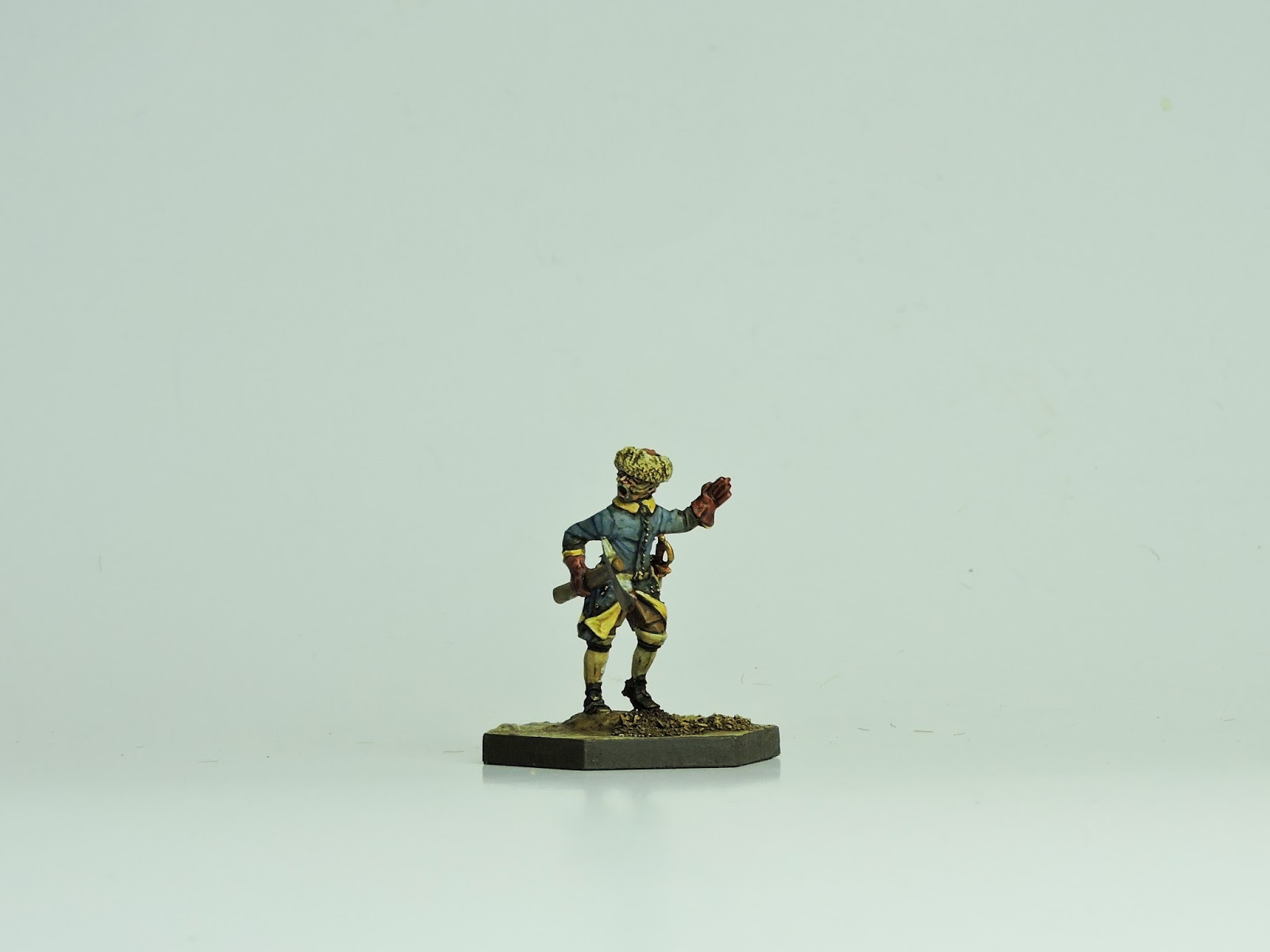
The look I wanted to get with these models was a faded, dirty, washed out effect. They have been in the field for over two years without proper resupply from home. If a parade ground look ever existed in the early 18th century which I doubt, these chaps are as far away from that as is possible. For those interested, a tip I would offer is avoid at all costs using black or white as a finished colour anywhere on the figure. Blacks should be brought up to a dark blu-ish, brown-ish or greyish tone.
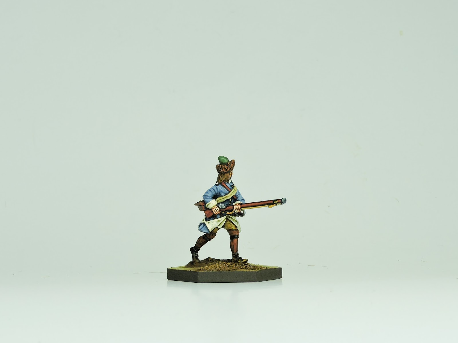 |
| Musketeer Bjorn Pilhage as painted as a Vasterbottens Regiment survivor |
Whites should never get brighter than a dirty cream colour. Only use bright primary colours in small patches such as a red neck cloth or similar. Softening the colours in the painting and then further dulling them with mild washes of toner or diluted inks will actually bring more detail our rather than lessen it.
Paint all the edges of cartridge boxes in a light brown or red leather tone to show wear - this works well.
I was working on several steps in the process simultaneously and this post highlights getting the campaign look.
 |
| Another view of Musketeer Bjorn Pilhage in his looted Russian cap |
First step is to paint the figure in acrylics over a black undercoat to get the faded on-campaign look. This involved trying to anticipate just how light and faded I could go on various colours. A degree of experimentation is necessary here but nothing is a failure because n two pieces of material or equipment will go through the same life experience. A variety in finish is therefore desirable even if accidental.
 |
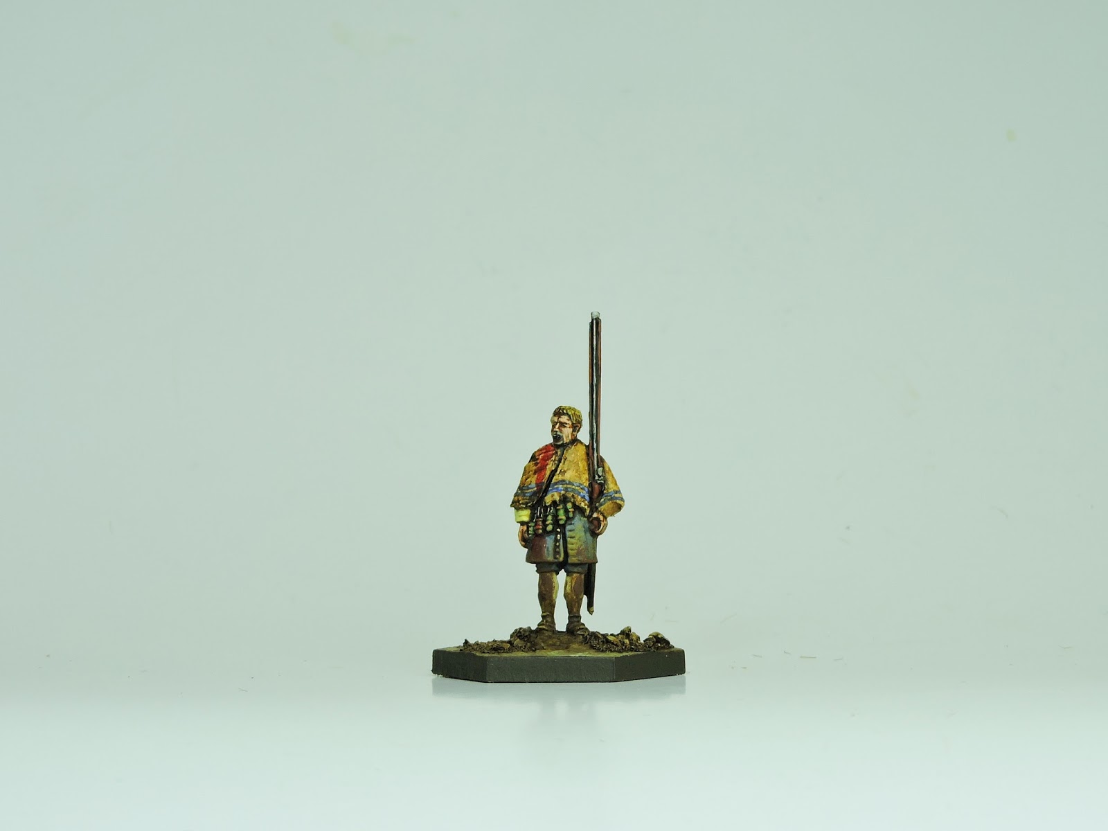
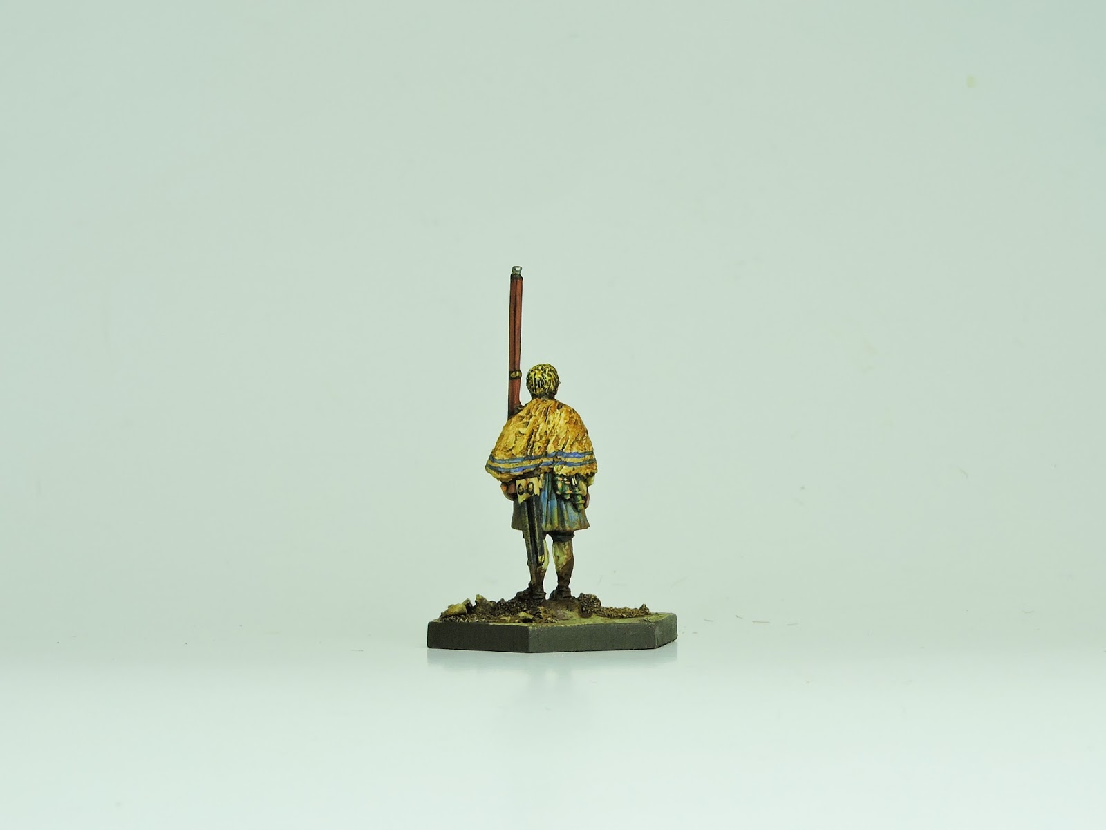
| Axeman Gustav Gustafsson - washed with a light tone to dull his colours |
The second step was to wash the whole thing down in a dull shaded coat to take the brightness out. This is a relatively recent addition from the Army Painter mob - a water based wash, probably the same effect could be achieved using black coffee dregs. Note to self - try black coffee dregs!
Sepia wash is very good but be careful and consider the dilution levels. Straight out of the bottle it will be strong and smother features. Dilute it to up to 75% and you'll get some nice effects. Skin/Flesh wash is useful too but various manufacturers have different ideas about what shade a flesh wash is! All are in fact useful for running over equipment, bags pouches and the like.
 |
| Wounded sentinel Johan Lund, painted, washed and weathered. |
The third step was to add mud and weathering to the clothes and shoes before finally varnishing. I thought about this weathering in reverse order. Old 'dried' mud is likely to be lighter in colour than new 'wet' mud. Your mud therefore may have to be applied counter intuitively - lightly dust the coat with a dry brush of Mid-Fleshtone or German Camo-Orange or similar first.
Dust quite high up the model and onto shoulders and hats (particularly edges). After this, take some darker tones and slap that on along the hems of coats, trousers, stockings and shoes in a more generous way. Wash the feet in undiluted Sepia ink to really bring them out. Any glossy effect will be eliminated by a matt varnish coat.
An intermediate step was the use of both washes and inks on various elements - coats, webbing, equipment, bags, flesh and the like before the 'Step 2' mentioned above.
 |
| Lund is wearing a torn blanket over his shoulders to stay warm. |
The various photos show the varying looks at different stages in the process. A flick through the other pictures that have already appeared and will appear in the next posts will give a further idea of the techniques.
This effect really does create the 'On campaign' effect I was trying so hard to get.